Fall 2020
BATL
Our team created a visual identity for a biopharmaceutical laboratory in hopes of emphasizing the innovative and experimental attitude at the core of their mission.
The Team

Jack Vogelsang
Project Lead

Iha Jain
Designer

Gayathri Raj
Designer

Calem Robertson
Designer

Mackenzie Kerwin
Developer

Mckenna Poulos
Developer

Chris Sedayao
Developer
Establishing a personality for a laboratory
The Biopharmaceutical Analysis Training Laboratory, BATL, is a Northeastern University affiliated research facility located at Northeastern’s Innovation Campus in Burlington, Massachusetts. BATL is known for conducting hands-on, comprehensive training and efficient drug research in collaboration with their international network. The facility came to Scout to make their philosophy more accessible and branding more reflective of that to promote the organization for those interested in learning more. Additionally, with their ongoing growth, they wanted to stray from their previous Northeastern-branded visual identity, and become a unique entity in order to better represent their stand-out offerings and achievements as they continue to grow. The scope of this project included branding, creating a marketing website, and crafting a logo that would fit in with the industry’s precedent.
Creating an effective design strategy
Our very first job as a team was to conceptualize different directions we could push the brand in. However, this process of establishing the foundation for the project was no easy feat. Some of our preliminary design strategy directions allowed us to eliminate what the client did not like and hone in on what they did.
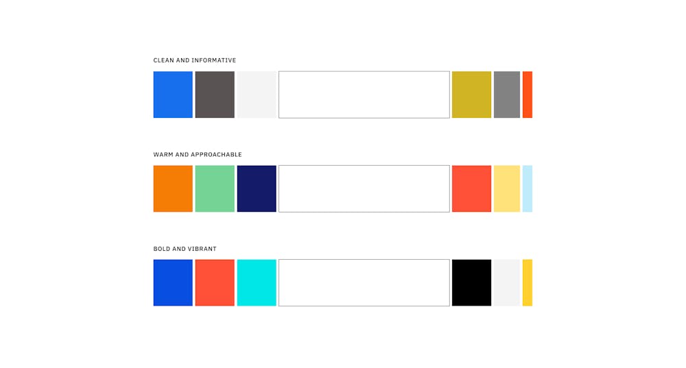
Our team’s initial color exploration
From the beginning, the client leaned towards a warm and approachable brand feel. This brand direction allows BATL to naturally stray from the complicated research and experimentation going on behind the scenes and present their brand in a digestible manner. Allowing BATL to appear warm and friendly, opposed to being sterile and exclusive, this brand strategy allows BATL to make their organization stand-out next to competitors in the industry.
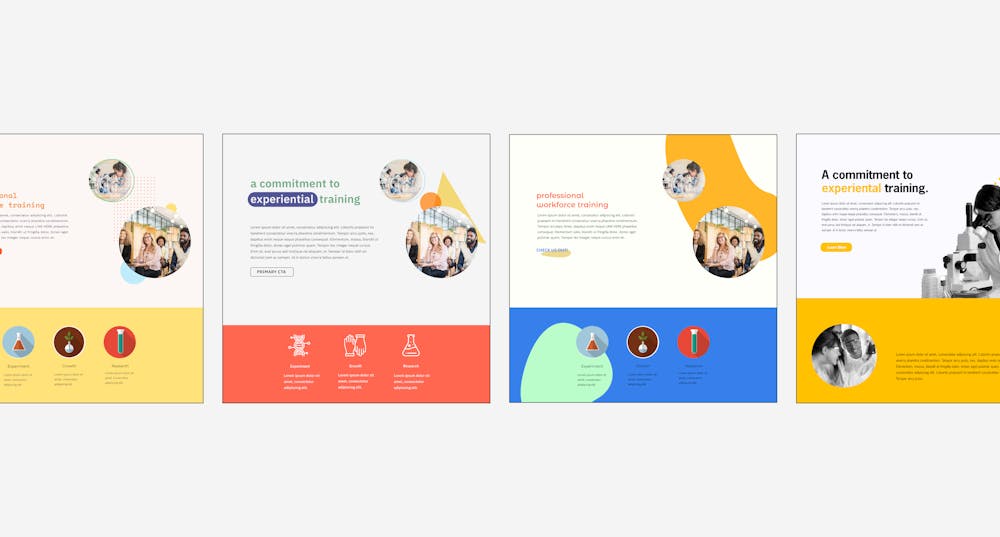
With the client’s preference for the warm and approachable direction, our team set out to explore that strategy in-depth. Exploring graphic elements, composition, color and typography furthered our understanding of their brand.
Workshopping with our clients, we learned more about BATL as a company in regards to their professional global audience of other research laboratories or pharmaceutical companies. While they wanted to be unique, bold and friendly, they also needed to maintain a level of professionalism and sleekness common in the industry. Through collaboration and critique, our team underwent a significant project pivot to make their brand slightly more fitting for their audience. This project pivot revealed to our team exactly what BATL’s desired brand personality truly is: bold, clean and approachable, blending the line between professional and unconventional. Our job from there was clear. We needed to incorporate the innovative and bold personality of a scientific laboratory while maintaining the precedent of professionalism in the industry. With bold yet simplified copy and an intuitive site composition, our team is confident that we were able to make this further refinement fully come to life.
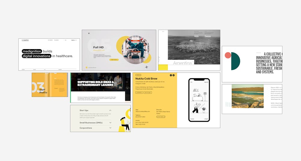
The project underwent a significant pivot when our initial color palette and graphic elements came into question. Working with the client to refine the professionality of the visual system, we created a new mood board that better represented the client’s desired identity.
Throughout our brand strategy process, we began to narrow our focus and settle on our typographic system, brand colors and graphic elements that would appear on the website and throughout BATL’s newly established brand. It was also during this time when we managed to land on a final logo design after weeks of iterating on the advice of the client in pair with the generous guidance from fellow Scout members and management. Using traditional scientific imagery, our team produced the logo of a flask that appears as a silhouette cutout in a circle. On its own, the logo is recognized as feeling scientific. Together with the wordmark, the arrangement of imagery and type allows for a timeless and elegantly clean logo. Our final version of the logo fits the professionality and modernity that BATL is starting to embrace, with the classic BATL yellow to add some energy to the entire composition.
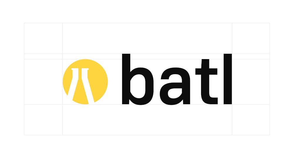
BATL’s new logo lockup with visible exclusion zones
Implementing a new website
Our team was able to initiate the wireframing process early on, which helped set up the information architecture and content model for each of the pages on the site. Presenting our lo-fi wireframes sparked discussion on functionality, interactivity and organization of these pages and the sections that filled them. Working with the client, we consolidated a plethora of information into just two pages, which cover the foundation of the ‘what’ and ‘who’ BATL is. With the ever-evolving research and new opportunities available at BATL, the website we designed allows for that growth where necessary, but more importantly, stays focussed on expressing the core principles of the organization.
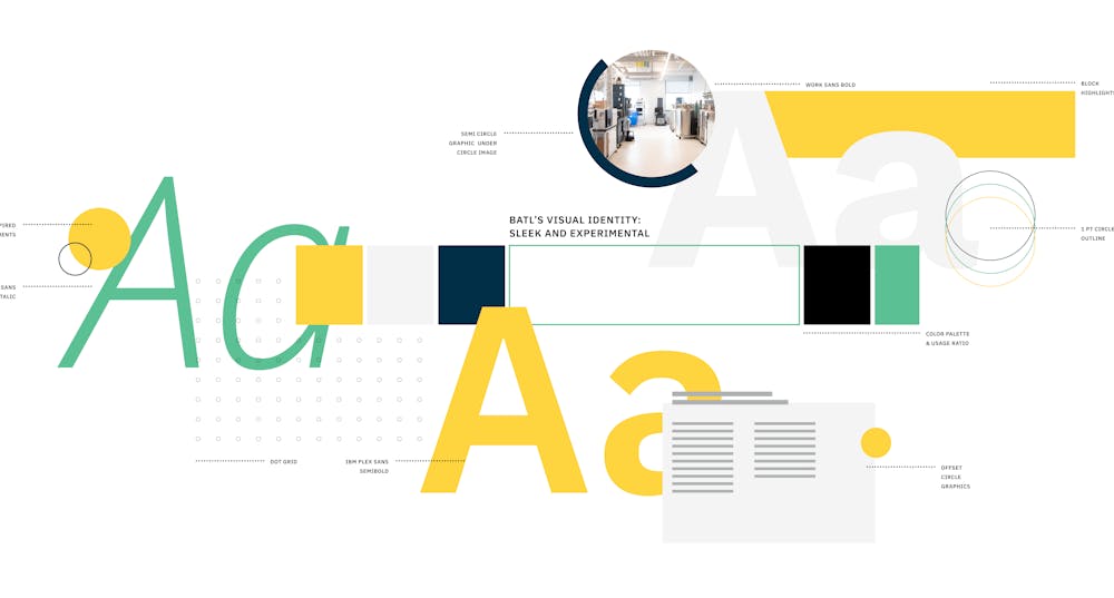
BATL’s finalized visual system with yellow, navy and gray as primary colors, white dominating the visual system, black for text and ‘molecular mint’ as the secondary color used in graphic elements.
Starting with these low-fidelity, black and white renderings of the pages, our team then applied the design system to this skeleton. The transition to high-fidelity designs was a matter of adding our brand colors, images and applying the typographic hierarchy. Merging the graphic system with the wireframes allowed for both designers and client to see what was working, and what was not. After further revisions were made to the brand, we arrived at our final prototype that captures the scientific nature of BATL, with a warm and approachable twist.
Launching the brand
The project concluded with the launch of BATL’s new website, which encapsulates every aspect of the newly created brand. Utilizing the new logo, brand colors, typographic system, graphic elements and UI components, BATL’s site meets all of the criteria that the client was looking for. To make the transition to the new brand straightforward, the designers created a brand book containing visual and component guidelines for BATL. The developers on the team packaged step-by-step documentation, making any sort of manipulation to the website an easy endeavor. Our team wanted to make these two handoff items as helpful as possible from a non-designer or non-developer perspective so that the client can continue to grow the organization and maintain the design that our team has established.
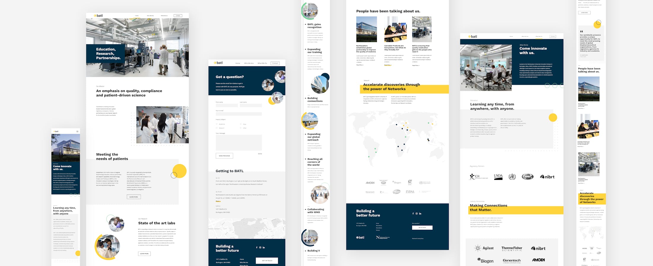
As the semester came to a close, our team was able to see our hard work come to life in the functional and responsive site. Our team is incredibly proud of how we were able to be so agile and collaborative in a fast-paced digital work environment. Despite never being able to meet in person, each team member was able to put their heart into creating an engaging brand and website for BATL.
Next Case Study
Rooted Living
Wanna stay in the loop?
Join our mailing list!
