Spring 2020
Better Than Belts
We created a new brand from the ground up as well as an e-commerce website and marketing collateral for a local lifestyle brand.
The Team

Sarah Porter
Project Lead

Jack Vogelsang
Designer

Maybelline Perez-Villatoro
Designer

Silvia Diaz
Designer

Vinny Carlino
Developer

Tina Wu
Developer
Finding a voice for a lifestyle brand
Better Than Belts is a young, scrappy modern lifestyle brand aiming to reinvigorate the suspender. They first approached Scout with a fragmented brand voice and a vague sense of identity; our challenge, therefore, was to strengthen their identity as a brand through the process of building out a cohesive, scalable design voice, keeping in mind the growth in product offerings that BTB may undergo in the future. The scope of the project included brand, a marketing/e-commerce website, and marketing collateral.
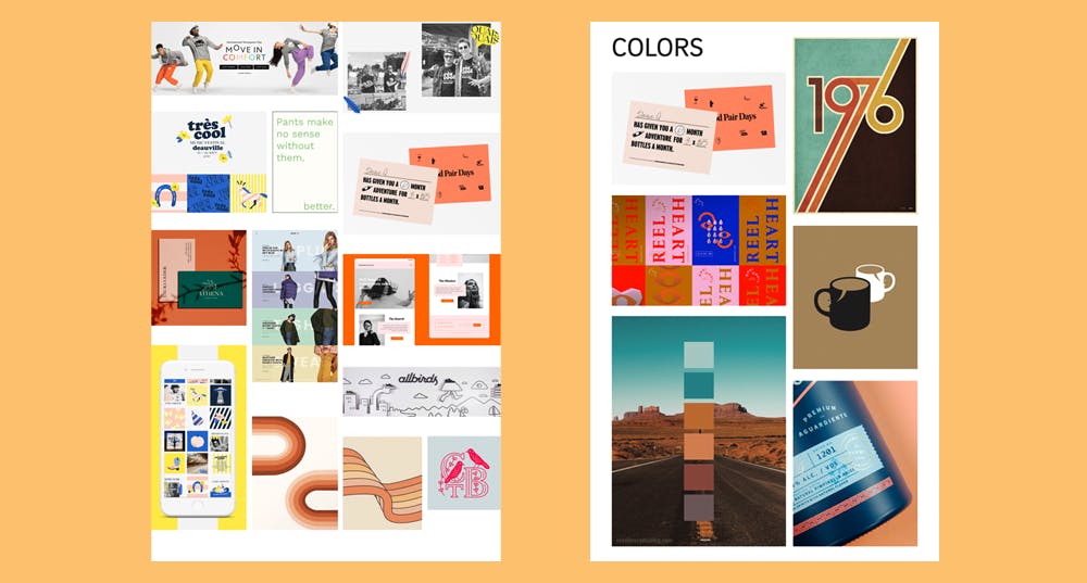
Our very first job as a team was to help them clearly identify their mission and their audience before any design began. In order to do this, we spent some time at the very beginning of the project working through brand voice exercises together as a team with the client. These brand identity exercises helped us to create preliminary visual moodboards, shown above. In these moodboards, we aimed to capture BTB’s brand essence: fun, friendly, approachable, and sincere.
Creating a visual identity
The process of building a visual identity took place in tandem with the process of the design & development of the marketing/e-commerce website. We participated in an exercise in style tiles: applying a tiny piece of what a visual system might look like in the context of the website.

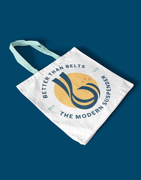
Throughout the style tyle process, we began to watch as brand elements, like colors, typography, and graphic elements started to fall into place. Around this time we also landed on a logo design, which embraces the distinct characteristic stripe of the suspender and the form of a lowercase “b”.
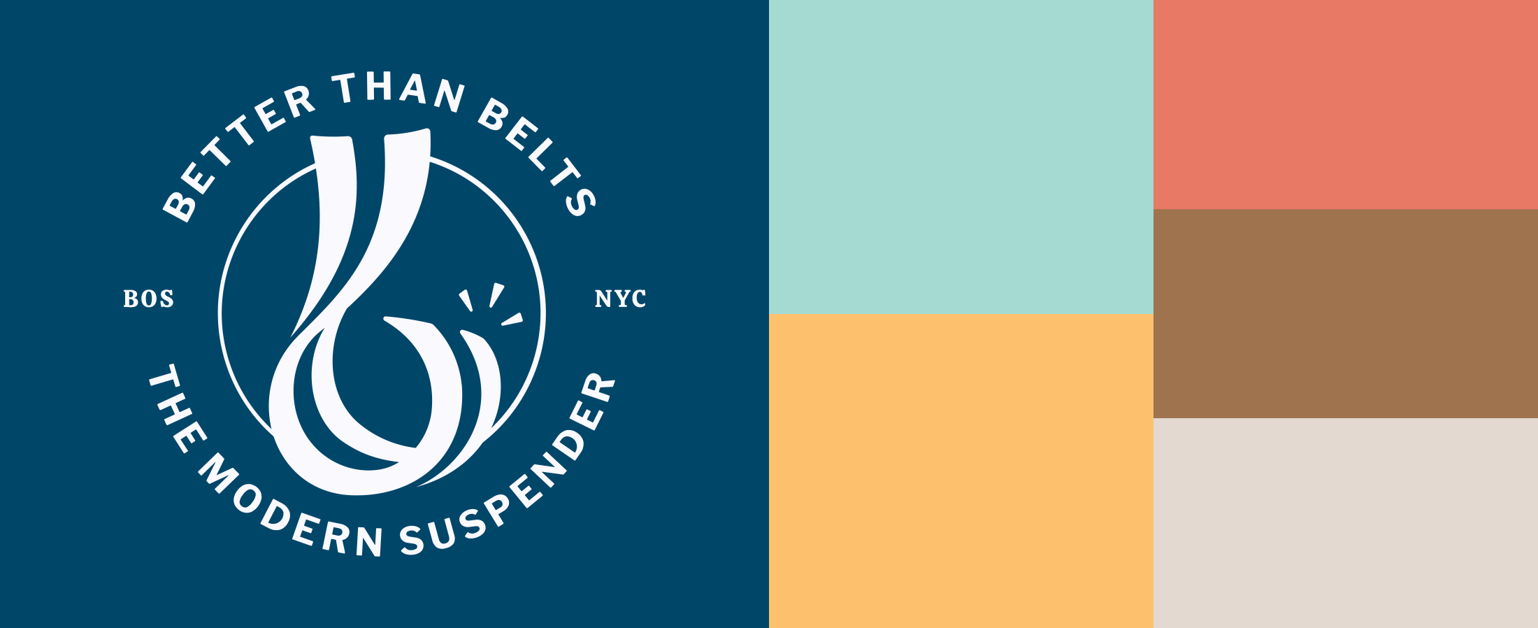
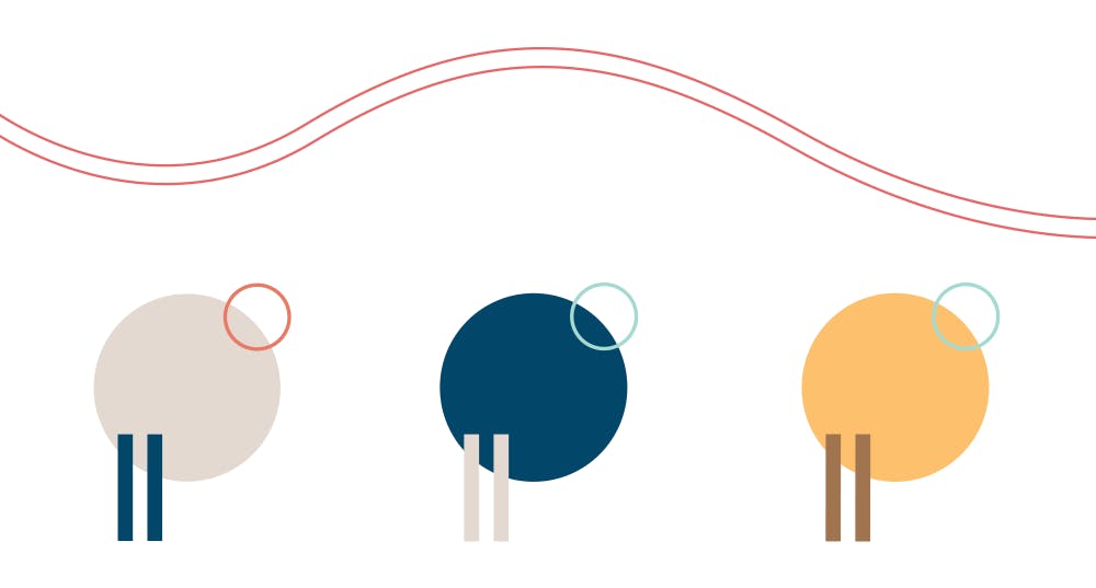
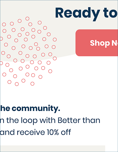
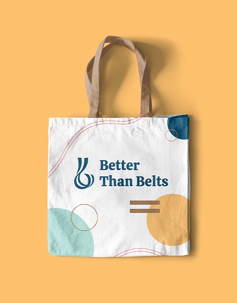
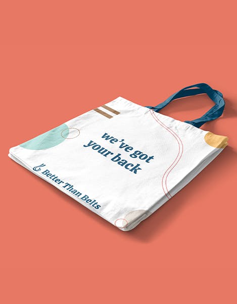
We knew the brand had to represent the origin and heart of Better Than Belts. We developed a system of graphic elements — wavy “parallel” lines and bar/circle lockups — to tie the brand back to suspenders, both in terms of color and form. These elements add dynamism and decoration to the brand, on the website and in print.
Building out the website
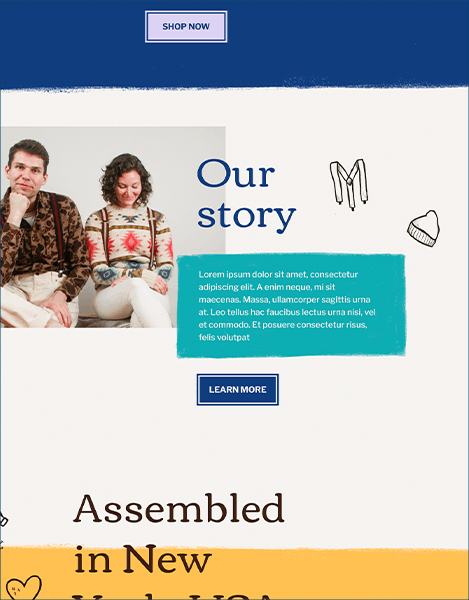
Early on, we developed a robust set of low fidelity wireframes that made the transition to high fidelity relatively simple with the visual language mostly fleshed out at that point. The brand was further refined throughout the process of creating high fidelity wireframes. We also designed and developed a fully functional e-commerce portion of the marketing website.
Our low fidelity wireframes were completely greyscaled and devoid of any detail by nature, which allowed for us to really nail the information architecture and the narrative that we wanted each individual page to follow.
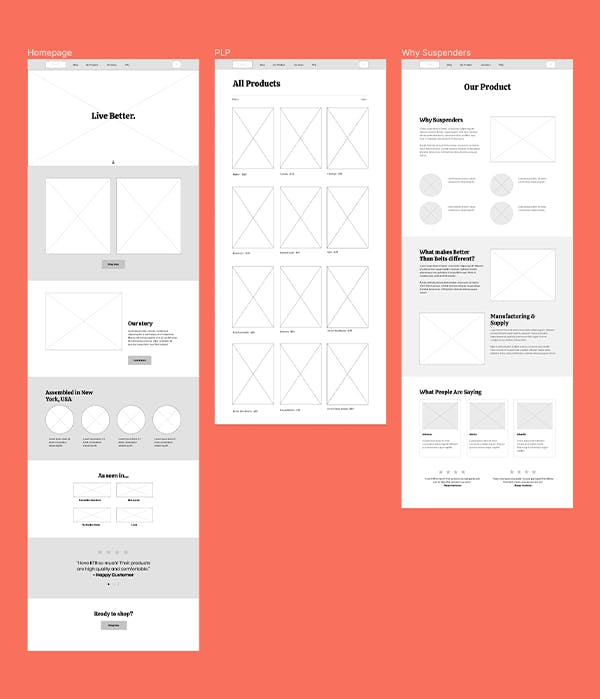
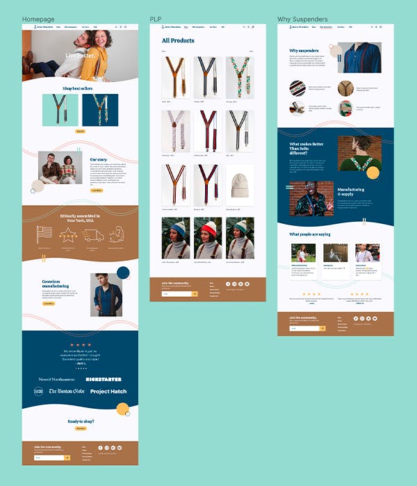
The transition to high fidelity designs was a matter of incorporating color and visual interest while preserving the established architecture of each page. Each page was designed, using color, typography, and graphic elements, to strike a balance between energetic and refined.
Next Case Study
Bikebus
Wanna stay in the loop?
Join our mailing list!