Spring 2020
Literacy Movement 4 More
We created a new brand and a marketing website to give LM4M a more professional and approachable look.
The Team

Roman Distefano
Project Lead

Sara Hartleben
Designer

Ariel The
Designer

Cassidy Hart
Designer
Helping a non-profit discover its new brand
Literacy Movement 4 More is a non-profit whose mission is to promote literacy around the world through the construction of libraries and provision of crucial educational materials such as technology and school supplies. Our clients were looking to expand their pool of partners by taking on a new, more professional, and refined identity.
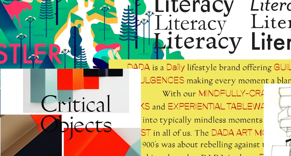
Early iteration of a brand moodboard.
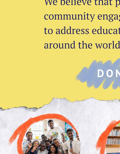
We wanted to incorporate a tactile design element to emphasize themes of writing, reading, and books. To achieve this, we began exploring different textures like ripped paper, grainy backgrounds, and sketchy illustration styles. We also chose an abstraction of the primary colors for our palette to further emphasize the concept of learning.
Refining our direction
The design team spent weeks iterating aspects of the brand elements and logo. We used style tiles to view our stylistic explorations in the context of the marketing website.
During this time, we also went through many rounds of logo refinement. We began with dozens of hand sketches, later moving into digital refinements, and eventually landing on our pictorial logo and accompanying wordmark. Working on a team of designers really gave us the ability to keep each other on our feet and push each other’s work to the best place it could be.
""We were consistently amazed by the diligence, passion, and professionalism of our Scout team. Their interdisciplinary diversity and vibrancy brought a special spark of magic to every deliverable that was produced. We couldn't have asked for a better partnership or team!""
-Seema Korumilli

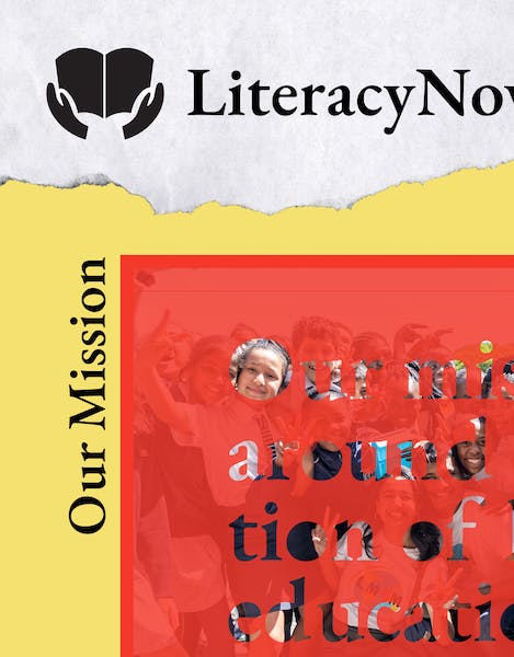
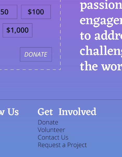
Once we nailed down our logo, colors, and brand elements, we were able to apply them to our wireframes. Starting as low-fidelity outlines of the site, our wireframes slowly became populated with the LM4M brand, bringing them to life.
However, the work did not stop there. The desktop and mobile wireframes went through many rounds of iteration as we tried to balance the brand aesthetic with the user experience of the website.
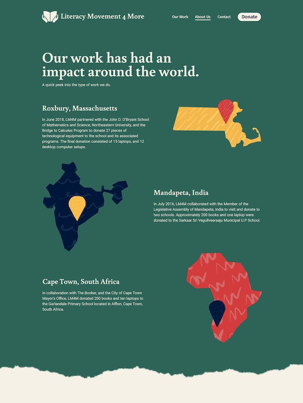
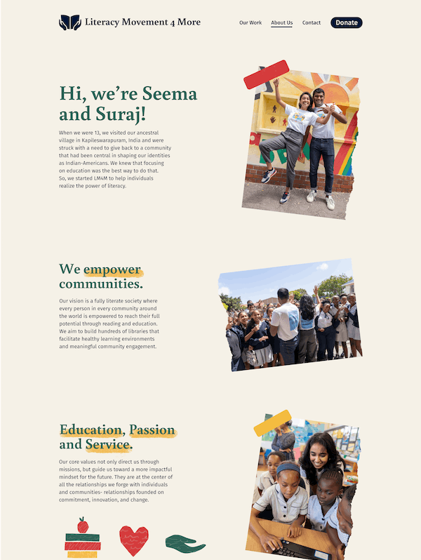
Illustrations, icons, photography, and type all had their own specific treatments which gave the site a unified feel. As this was most of our first times creating an entire website, this process of standardizing the design elements took the longest.
Wrapping it up
The final site and brand system convey a sense of professionalism while still maintaining a fun, light-hearted vibe. This was so much fun for us to work on and gave the team and clients so much insight into the world of brand development. We hope our work gives Literacy Movement 4 More the platform to expand their brand and keep helping children around the world!
Next Case Study
Mango & Marigold Press
Wanna stay in the loop?
Join our mailing list!