Fall 2019
Saltwater Classroom
We created an updated brand identity and kid-facing mobile app for an ocean education nonprofit.
The Team

Cassidy Hart
Project Lead

Jay Brimeyer
Designer

Celine Yan
Designer

Kincaid O’Neil
Developer

Dania Alnahdi
Developer

Anika Jagow
Developer
Dipping our toes in the water
Saltwater Classroom is a hands-ons, experience-based program that provides ocean education through week-long workshops. Tailored for students in 4th-6th grade who are at a critical stage of development, Saltwater Classroom brings kids together over a passion for our oceans at a time when conservation is more critical than ever.
We wanted to provide Saltwater Classroom with a brand identity that would fulfill multiple needs. The identity needed to be fun and friendly enough to be applicable to any kid-facing assets such as the mobile application and workbooks. It also needed to be functional for any outward facing assets, such as brochures, business cards, or grant application materials. Additionally, we wanted to maintain any existing brand recognition by upholding elements and characteristics of the current brand. Ultimately, our goal was to set Saltwater Classroom up with an adaptable, distinctive, and expandable visual language and voice.
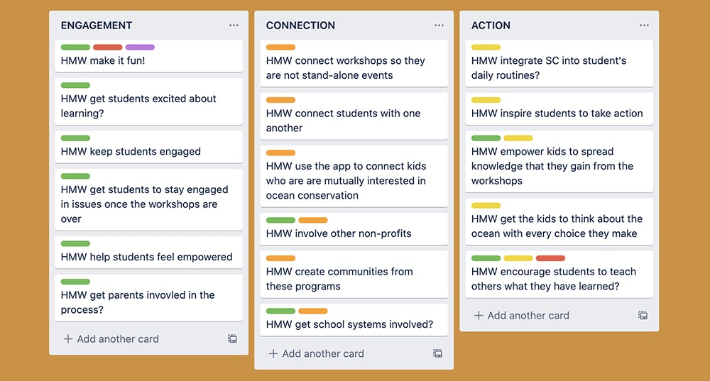
One of our first steps was to think up a bunch of How Might We questions to pinpoint the goals and motivations of the project. Because our client was based in Maine and often traveled for the workshops, most of our meetings were done virtually and our card sorting exercises were done using Trello.
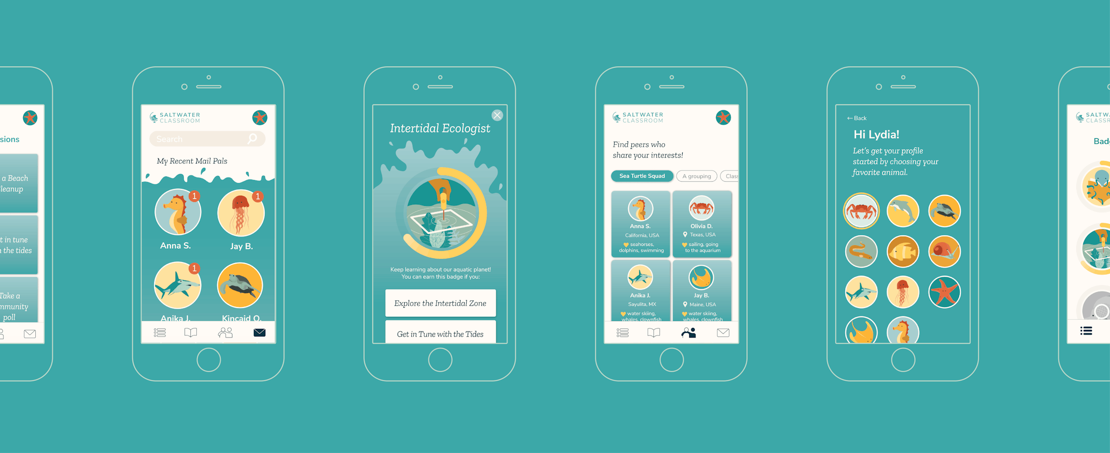
We also set out to design a mobile application that would bolster the global Saltwater Classroom community by making dialogue and conversation easy, safe, and rewarding. In creating an engaging platform where students could band together to further their own ocean smarts, we wanted to take Saltwater Classroom’s tagline, “ocean education through global collaboration,” to the next level. Thinking about our project timeline, we agreed that we would design and develop the front end of the app and our client would use our designs to hire developers to complete the back end.
Our audience for the project was mainly kids who had participated in a workshop and had a desire to continue to engage in the issues and connect with others who shared their passion. For these kids, it would be important that the app would make it easy and fun to continue learning, prioritize safety, and be rewarding to use. We also kept in mind the parents, teachers, and Saltwater Classroom staff who would be facilitating and supervising these mobile interactions.
Setting sail
To kick off the project, we did a series of exercises with our client to establish our understanding of their brand voice, goals, and audience. These exercises guided our design choices as we began to explore color, typography, logo, and illustration.
We explored various directions for the logo, but decided to stick with refining their existing mark—a clever combination of a globe and a wave. After making a few changes that made the logo feel more polished and understandable at any scale, we began to address typography and color.
Keeping in mind that we wanted to retain their existing brand recognition, we didn’t stray too far from their existing typography either. We did want to provide them with the flexibility of having both a serif and sans serif option, so we eventually settled on Nunito Sans and Zilla Slab. After exploring a huge variety of possible color palettes, we decided on a range of blues and oranges that we used throughout all of our final deliverables, including illustrations.
Diving in deep
With a solid brand nailed down, we began to explore the possibilities and expectations of the mobile app. To start off, we explored ideas and embraced all possibilities, aiming to have a vision of the most ideal iteration of the app. Working with our client, we created user stories and sitemaps, going back and forth to pinpoint the experience we wanted to create for kids who would be using our product. We also hoped to understand what the kids themselves wanted and expected out of the experience, and so we created surveys that our client sent out to former students, parents and teachers. This feedback was extremely helpful in understanding our audience and their needs.
Because we had only four months to complete the project, it was important to look at our list of desired features and prioritize—what features were essential and what features were just nice to have? And once we knew what our essential features were, how did they relate to and interact with each other? To answer these questions, we did several card sorting exercises with our client, where we placed features together in categories to understand where they could exist on the app.
Next, we moved into creating low-fidelity wireframes without branding so that we could focus on the functionality of each page of the app. We were especially concerned with clarity and accessibility, considering that our target audience would be elementary-age kids. After multiple rounds of edits based on feedback from our client, we applied our new brand to every page of the app, creating high-fidelity wireframes.
Fin
In the end, our team successfully delivered an updated brand identity, a clickable prototype of high-fidelity wireframes, and a developed front end. Our client had the chance to test the prototype with young kids at one of the Saltwater Classroom workshops, and it was met with enthusiasm (and adorable comments). Now, Saltwater Classroom is using our prototype to work with developers to complete the back end and launch the app.
Next Case Study
Literacy Movement 4 More
Wanna stay in the loop?
Join our mailing list!