Fall 2020
B612
We created a simple brand identity, alongside a concept website that captures the essence of B612's wellness experience product. Our brand work reflects the company's values of lifestyle balance in an age of digital exhaustion and hustle culture. Explore how B612 can help you recharge and seclude in a private space when it launches in 2021.
The Team

Gino Jacob
Project Lead

Layla Baghai
Designer

Shannon Haley
Designer

Franny Kuth
Designer

Eric Kim
Developer

Thomas Wang
Developer

Jean Zhang
Developer
B612 has a unique twist on the getaway space and lifestyle balance formula. They were in their early prototyping stages when they first reached out to Scout, and the project presented a rare opportunity for us to imagine the many ways a new product could penetrate and stand out in a saturated market.
This case study will not feature specific details about B612’s product but rather focus on the purpose of the brand and why customers may one day find it useful for them. (You can follow B612’s Instagram to learn more about the product as it is revealed to the public.)
Polaroid, a snapshot in time
The project was a fresh new canvas for Scout — B612 had never established a brand or marketing website. We had the creative freedom to explore different strategies, and after proposing 6 distinct designs, we settled on a strong direction that we eventually dubbed "Polaroid".
Among the brand personalities, we decided on were approachable, conversational, clean, warm, and emotive. We researched direct and indirect competitors extensively, from similar companies such as Airbnb, Getaway, and Booking.com to tangential products like Bumblebee Spaces and On Being. On top of capturing these personalities, B612 should use engaging editorial content, employ a unified visual language, and favor emotional investment over transactional customer relationship to stand out among its competitors.
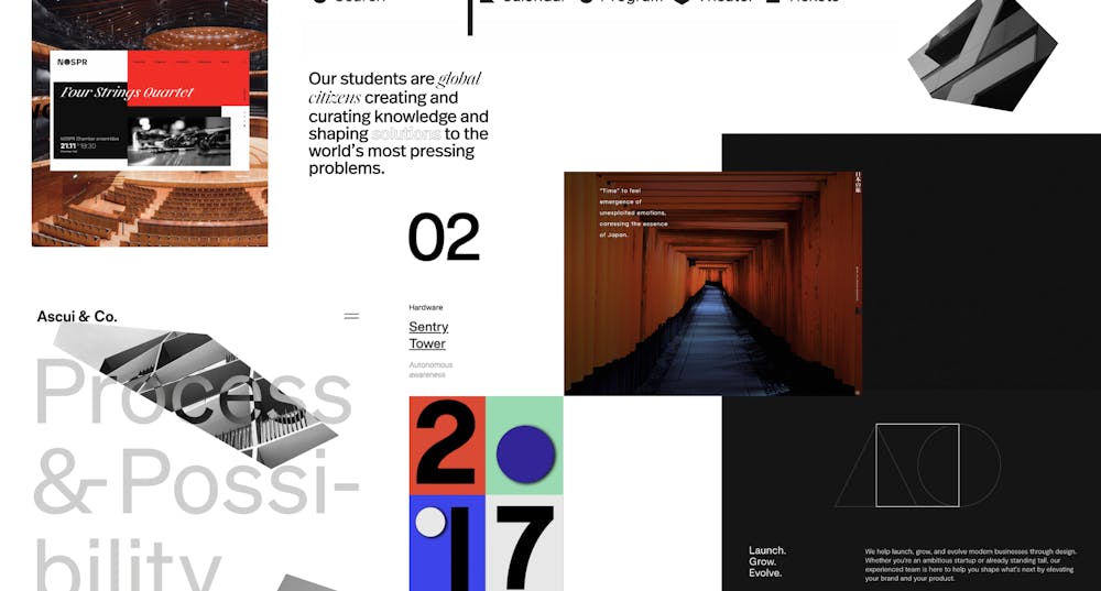
Polaroid was inspired by our "Minimal" moodboard, a curation of the web's cleanest and most elegant experiences.
Motifs, elements, content
There’s nothing more "in the moment" or nostalgic than a Polaroid shot. We want B612 to convey these honest moments in a space that is simple, quiet and balanced.

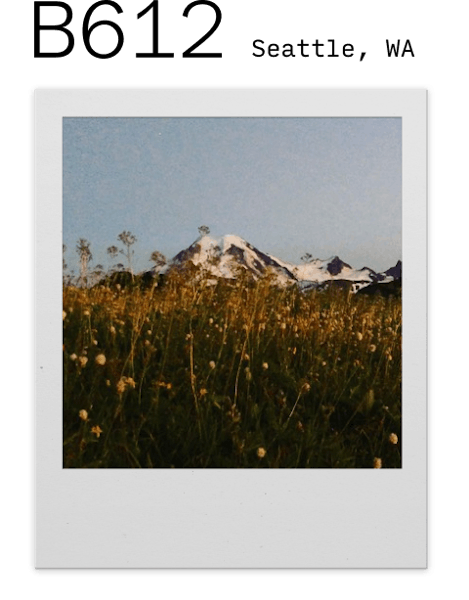
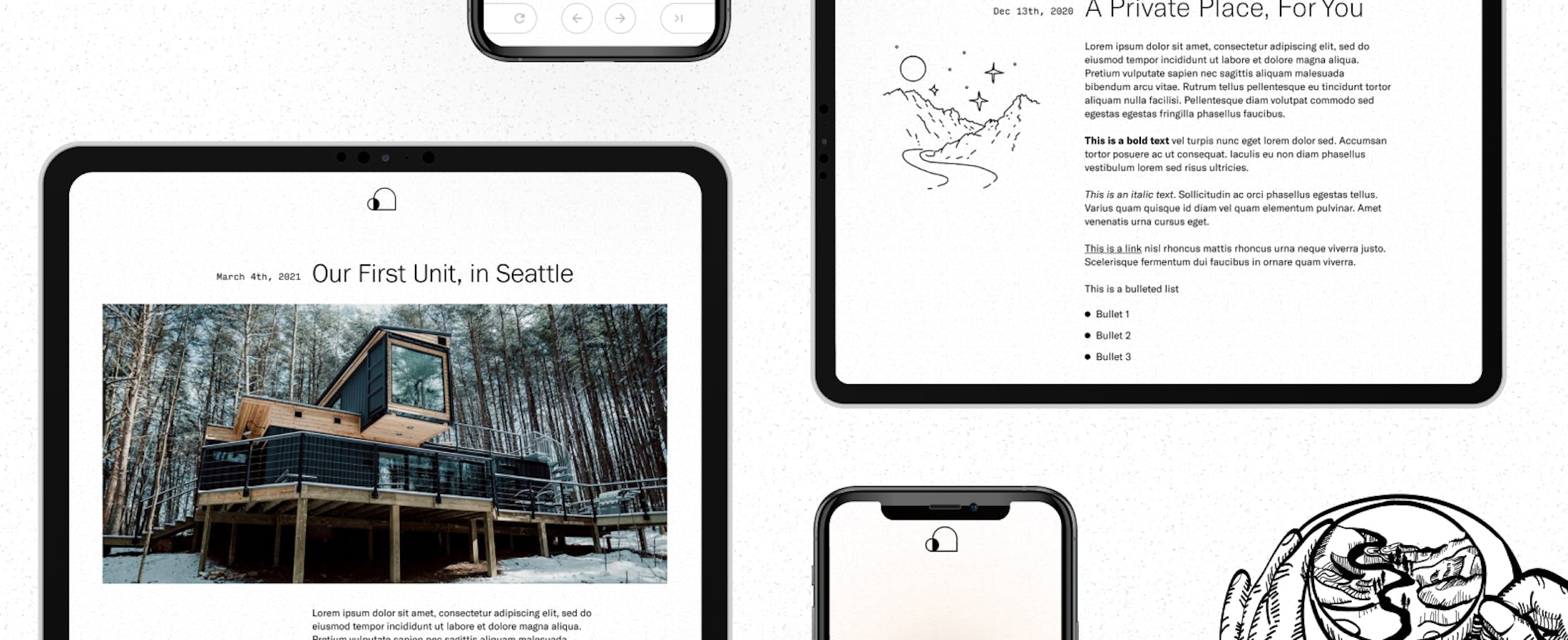
Designing brand elements around Polaroid as a motif let us play around with unconventional web elements such as a Polaroid frame, script handwriting, and a grain texture. The intimacy of photography harmonizes well with B612's focus on their guests and their spiritual experience with the product.
""There is beauty, detail, and intention at every corner... Working on this with [Scout] has been one of the most defining and rewarding experiences of my year.""
-Bertrand Vacherot, Founder of B612

Handwritten guest reviews, crowdsourced lifestyle blogs, and live feeds of Washington's rich flora and fauna were a few features we considered that would complement our design strategy. In the case of B612, our design direction helped inform the content strategy.
Logo imagery
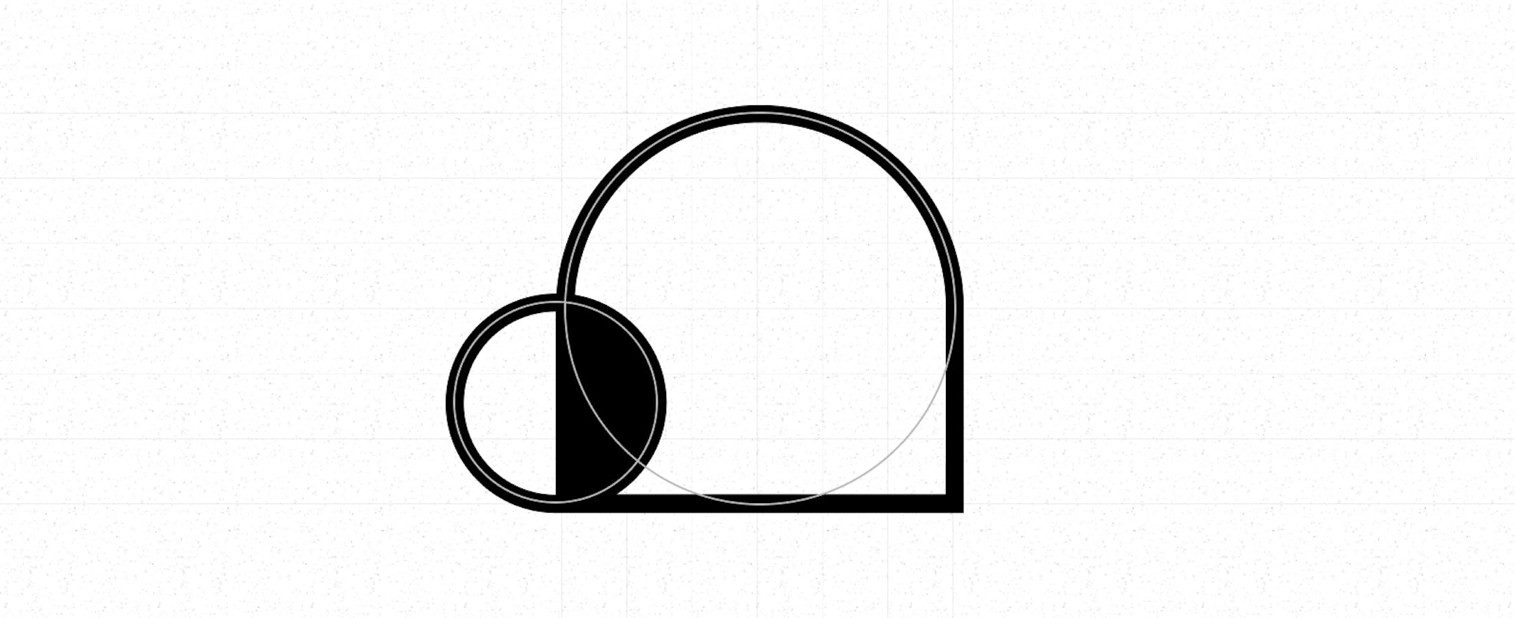
A logo should embody the company's mission. For B612, we arrived to the above logo serendipitously, after using its previous iterations as placeholder logos in our high fidelity wireframes and receiving wonderful reactions at our alumni crit, where Scout alumni critique in-progress work.
The arch symbolizes a B612 space. As a visitor (the ellipse) enters the space, they are deeply transformed. The dichotomy of their two halves represents the lifestyle balance B612 offers to the introspective or urban hustler. This strong yet simple imagery is a powerful way of solidifying B612's values in all of its marketing endeavours, be it a newsletter or an Instagram story.
Pivoting to a conceptual website
Our initial arrangement was to build a general-purpose marketing website to feature B612's product. Halfway through the project, our client underwent a product pivot that the client was not ready to disclose to the team at the time. A change in the scope of the project meant that a marketing website no longer made sense. We instead turned to a conceptual website that would illustrate the idea behind B612's offering. Rather than sharing product details, we wanted to evoke emotions from visitors and encourage them to follow B612's growth.
It was a matter of being resourceful with the information we gathered from the design activities and workshops we had already done and being nimble with our research focus for the rest of our sprints. Here are a few actions we took to accommodate the pivot:
Brainstormed a set of information the team can commit to and avoid. For example, we should avoid displaying or hinting at specific features (furniture, wallpaper, location, etc.) of the B612 space, but we could commit to stating that the space is physical and will be launched in 2021.
Revise which pieces of our research we could keep and drop.
Revise B612's elevator pitch to ensure that the team has a complete grasp of the product, or at least to the extent we're allowed to know given the patent.
Rethink the brand elements of our design. Some can work on the concept website, while the others are more suitable for B612's future marketing website.
Adjust our chosen technology stack given the new requirements of the concept website.
The team proceeded to storyboard concepts for the website experience in place of doing lo-fi wireframes. We teetered between a meditation experience and a "choose your own path" experience before finally committing to a series of conceptual illustrations broken down into individual scenes in a narrative that describes the many ways a person can appreciate a B612 space.
Series of illustrations
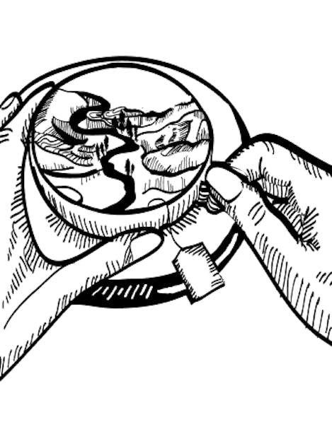
Our concept website features a strong series of surrealist and dreamlike illustrations that are crucial to communicating our message in an evocative way.

Pinning down the visual language and style of the illustrations was the natural first step. Thanks to our talented illustrator, Franny, we were able to quickly experiment and tune our illustrations based on the narrative we were iterating on.
In a workshop, we had each designer briefly churn out concepts and rough sketches for a scene's illustration. We would then take some more time to deliberate on the ideas together before finally settling on a direction. Rinse, and repeat for each scene. All that was left for the rest of the semester was for our team to iterate and finalize on the illustration style.
JAMStack and Forestry



On the other side of the team, the developers had to reassess the technology requirements for the project. A marketing website with ever-evolving content would require a more flexible static site generator depending on whether B612 wanted to prioritize data freshness over faster page load. In the case of our pivot, a concept website has less frequent content updates and needs faster page load time to ensure that the digital experience runs smoothly.
Initially, our chosen technology stack was Next.js for the frontend framework, Sanity for the content management system (CMS), and Vercel as the static site hosting provider. We switched over to Gatsby, Forestry, and Netlify with the pivot for the following reasons:
Content updates will be infrequent so Next.js' advantage of data freshness is less relevant. Gatsby would afford faster page load time.
Sanity is a much more opinionated and integrated CMS compared to Forestry. Given the short timeframe of the project, Forestry's git-based CMS and opt-in configurations would've sped up development and still fit the business requirements.
Netlify is better optimized for static sites. Switching to it came organically with our decision to use Gatsby.
How we came to understand B612
B612 is a unique venture whose mission goes beyond the specifications of their product. We dedicated a great portion of our partnership to really empathizing and understanding our client's motivations and goals. The brand identity and concept website are products of not only the creativity of our designers and developers, but also the personal investment of each individual involved in the project, the unwavering cooperation of B612, and our solidarity for the venture's mission.
Next Case Study
BATL
Wanna stay in the loop?
Join our mailing list!
