Fall 2021
Stō
We built a brand, took product shots, and created a website for the micro mobility scooter Stō. Creating animations of their scooter along with slide decks and business cards, we helped Stō win Demo Day, Northeastern University’s Premier Startup Pitch Competition, where they secured funding. We were able to allow them to focus on their product while we worked on creating their story.
The Team

Eric Kim
Project Lead

Sam Gildea
Tech Lead

Gwen Friedman
Developer

Jueun Kang
Developer

Jenny Chen
Design Lead

Livia Lemgruber
Designer

Oliver Hu
Designer
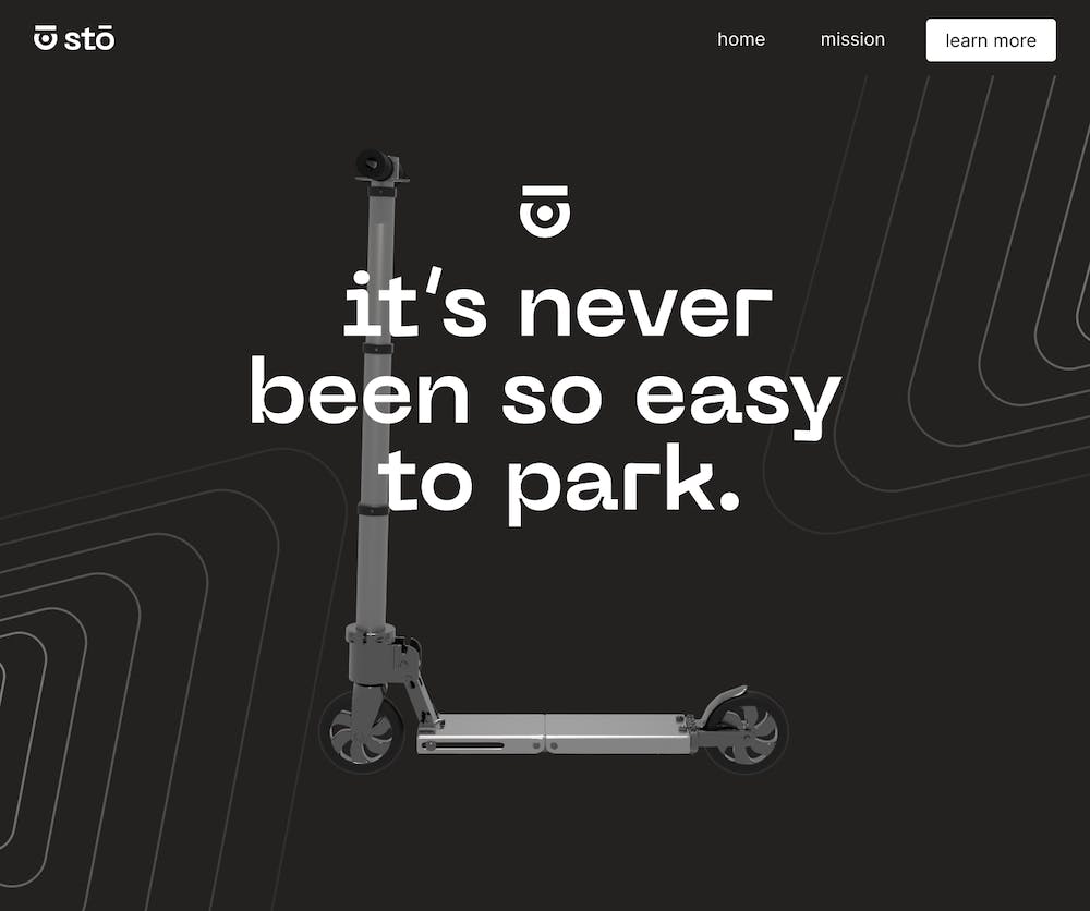
It’s never been so easy to park
Stō is a scooter that can fold down to fit into a backpack, perfect for college students or last-mile commuters. Co-founders Victoria Napolitano, Jack Streed, and Ben Frothingham had an idea to enter the micro-mobility market with a new solution to human-scale transportation. With their focus on creating an innovative product, Scout was able to step in to help tell and share their story.
How can Scout help?
With a prototype coming out soon, we wanted to make sure Stō would be ready to go-to-market. To do this, we came prepared to create a brand along with a new name, logo, slide deck, and business cards while also building our clients a website. In addition, we wanted to highlight the features that set Stō apart from other micro-mobility devices so we collaborated with Scout’s Production team to create photo and animation assets to help tell their story.
Discovering the brand
We started this project off by understanding what direction the brand should take. It was important for us to understand how the client viewed their product and how they saw their product differently than those currently on the market.
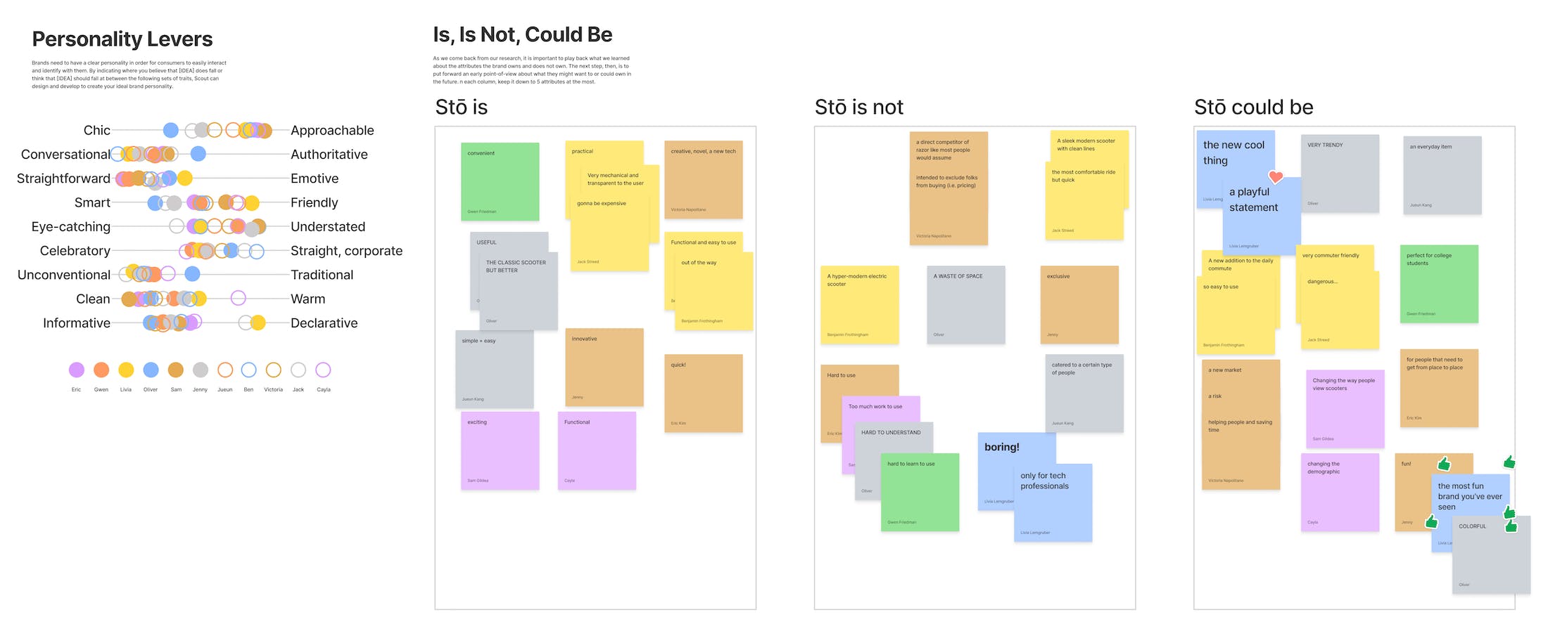
After studying 18 different competitors and some brand exercises, we came to an agreement on the target audience and Stō’s voice. These exercises laid the foundation of the brand discovery as we would present 6 different strategies. These were explorations in color, typography, and photography slowly pairing and combining ideas till our clients were satisfied.
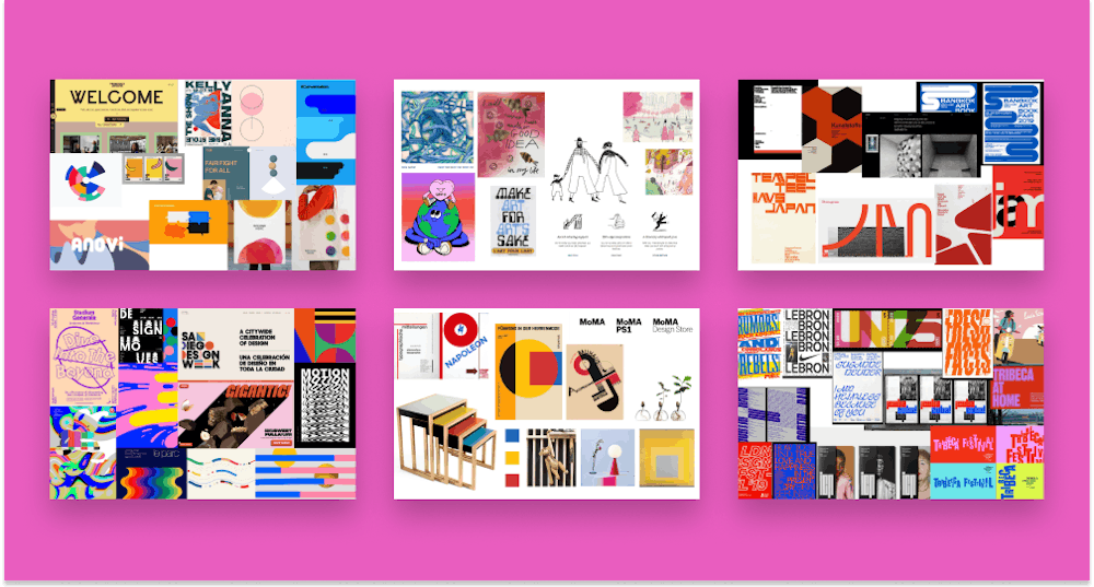
Top: playful + conversational, nostalgic + friendly, clean + smart. Bottom: color in motion, bauhaus + fun, unconventional + a pop in color.
Creating an identity
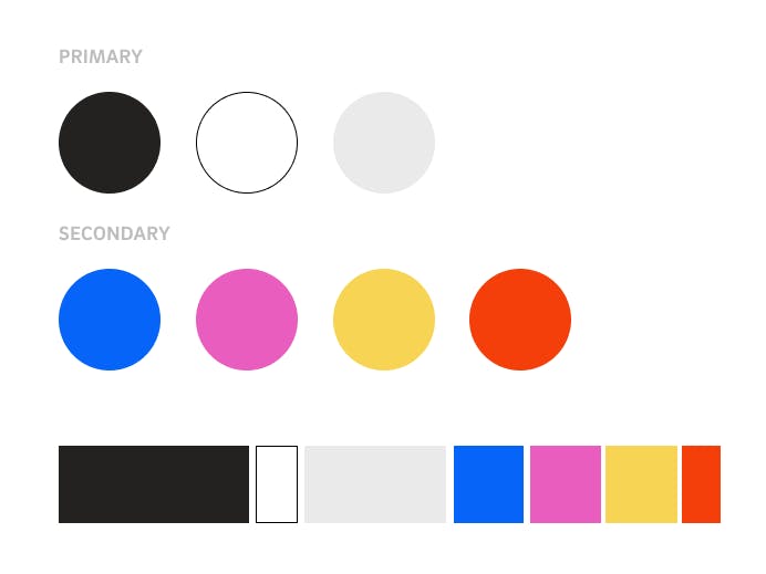
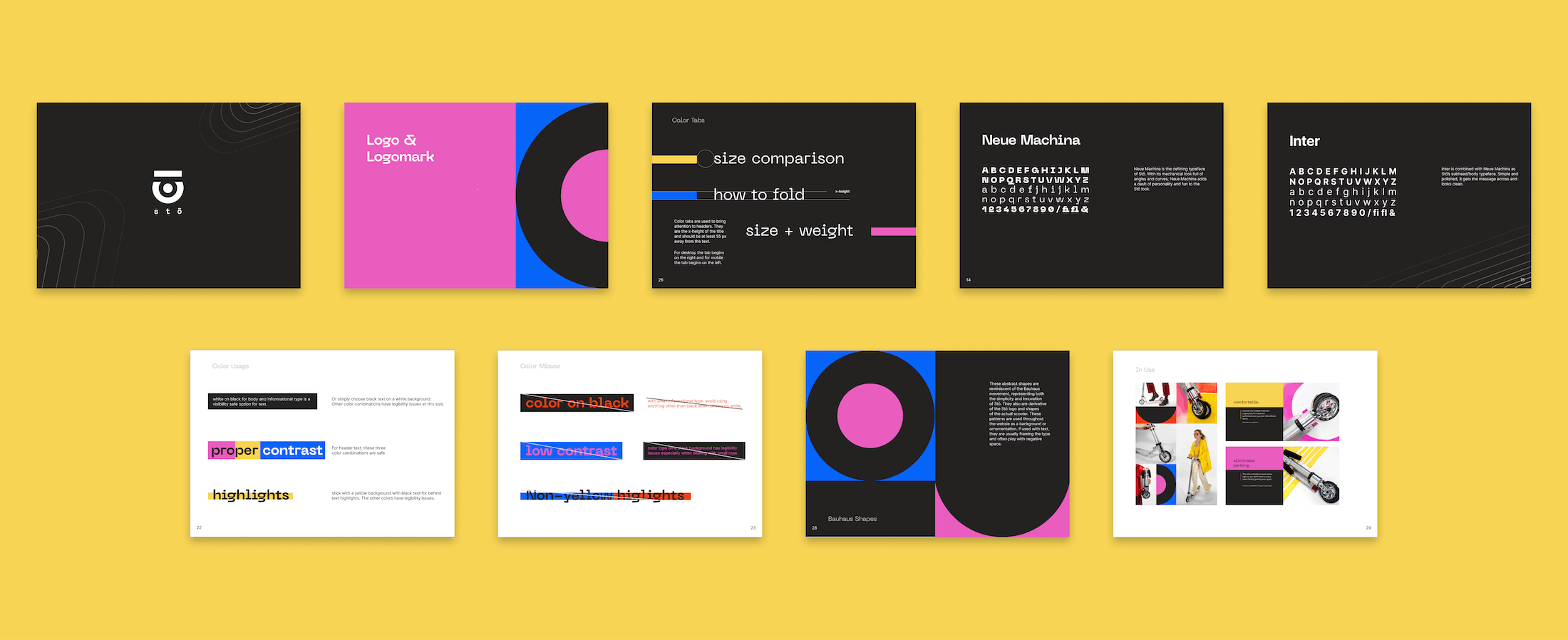
We ultimately went with this idea of Bauhaus Machina, utility with color, simple and bold, fun and industrial. This design strategy hopes to strike a balance between seeming clean and smart, but with a fun Bauhaus twist. With controlled color and a grounded type, Stō can combine two separate worlds into one brand.
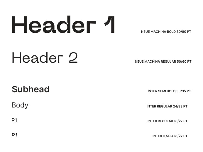
We stayed with a traditional Bauhaus color palette using primary colors and added a nice magenta and made them all brighter to add some fun. In our type, we wanted to choose something that could represent Stō’s innovative folding mechanism while also being able to convey a sense of motion.
How we came up with Stō
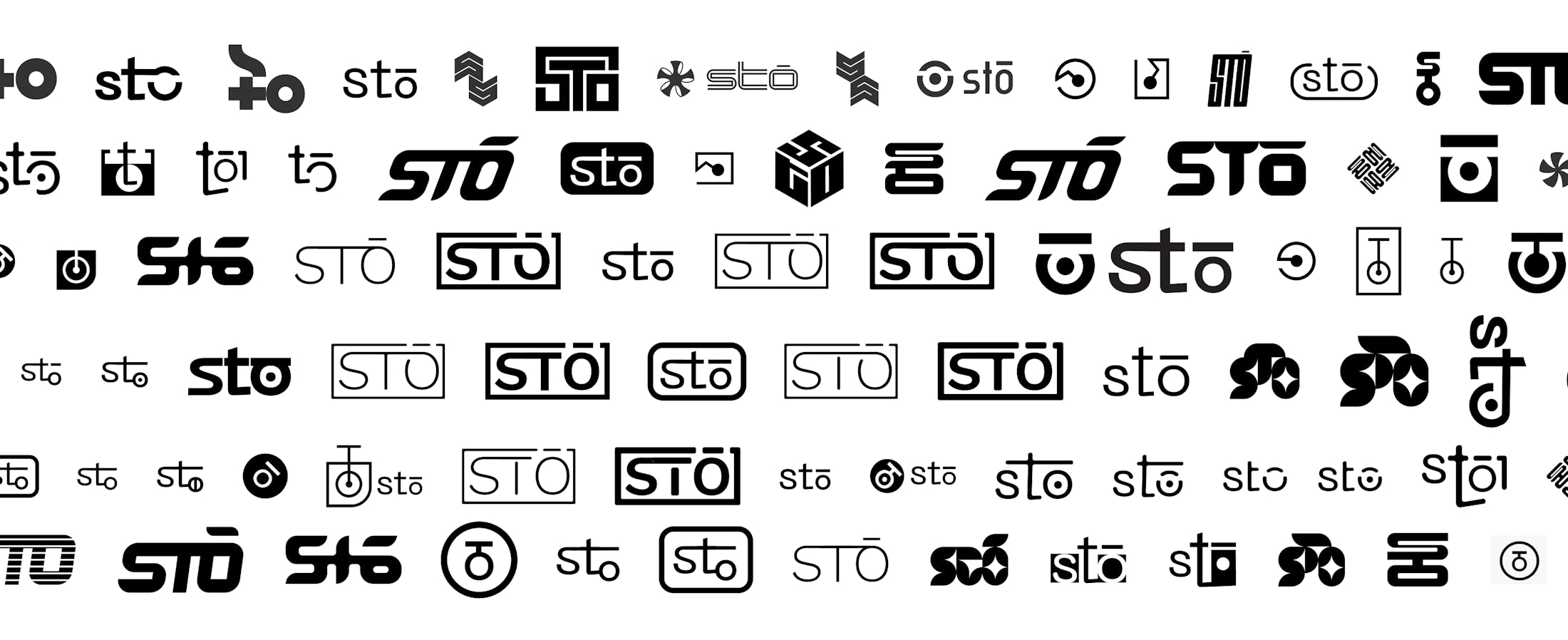
After coming up with a brand we wanted to create an accompanying logo. However, in order to create a logo you need a name. Fun fact: Stō's original name was Scoot, which would’ve been great if it wasn’t already another scooter company. This was questionably the hardest part of the process because we wanted to name it something that set this scooter apart from all of the other scooters already in the market. On top of that, we also wanted to think about how it would look on the steering column and deck of the scooter. After many name brainstorming sessions, the answer was in front of us the whole time.
However, now we had to address the logo. We tried different directions from lettermarks, logotypes, pictorial, and even abstract. After different interactions, we fell in love with the simplicity of a combination of a pictorial logo and lettermark.
Building a website
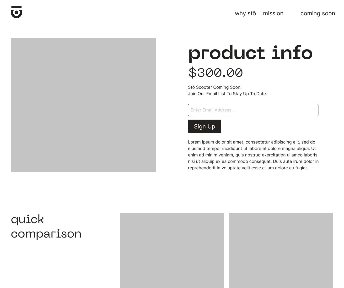
Once our brand was set, we created lo-fidelity wireframes allowing us to focus on the specific story we wanted to tell. The main goal of the site was to explain how Stō differed from the other scooter brands. Our clients weren’t in the position to start selling a product so we wanted to create something eye-catching that would get people interested and excited.
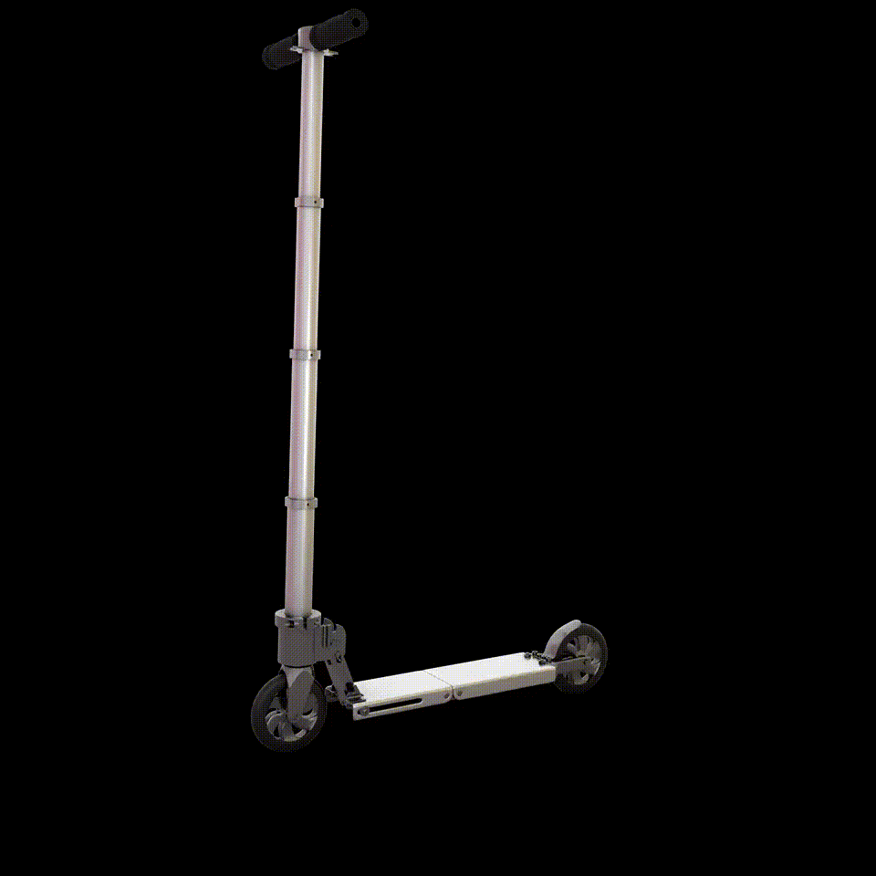
We wanted to showcase the impressive features and leave lots of room for images. Pushing the lo-fis to a higher fidelity brought our brand to life with a clean look and the added pops of color. The cornerstone of this website was the scrolling animation of the scooter.
Incorporating photography and animation
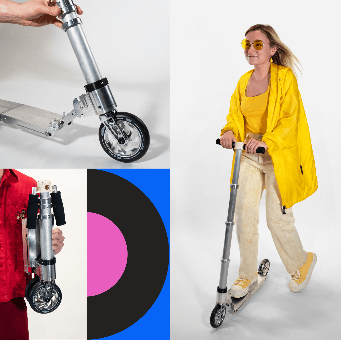
We collaborated with the Production team (Cayla Chow, Alex Agahnia, Norman Zeng, Alex Lawson, Grace McNamara, Gabby Aidam, and Anthony Fanticola), to help tell the story we wanted through photography and animation. We wanted the pictures to blend in with the website so we needed to figure out a way to have our brand shown in the photography assets. We kept the pictures clean and came up with creative ways to have pops of colors through monochrome outfits and edits with our Bauhaus shapes.
In order to make people understand Stō, we knew we needed to show it folding. This turned into an all-hand effort from the idea, to the rendering created by Production members Anthony Fanticola and Gabby Aidam, to the implementation of a scrolling animation that was the centerpiece of the website.
"The incredibly talented design and production teams were truly dedicated to transforming our capstone project from a simple scooter to a fully fledged company. Scout’s flexibility and drive to internalize client feedback and provide excellent work was outstanding. The branding designs, website development, photoshoot, and original animations went above and beyond what we ever imagined or expected!"
-Victoria Napolitano, Co-founder of Stō

Wrapping up in a brand book
With a brand as simple, yet complex as this, we wanted to make sure the client can easily maintain the integrity of Stō’s brand. We created a brand book that outlines all of the different design elements with the do’s and don’ts starting with the logo all the way to creating this Bauhaus effect.
How this project unfolded
Stō became the first studio project to create a website with the content created by Scout’s Production team. This project has opened new doors for collaborations between our studio and production team for website deliverables. Stō was a big project that had a lot of deliverables, but we were able to execute and bring Stō to life.
Our work did not go unnoticed as Stō won the Fall 2021 Demo Day, Northeastern University’s Premier Startup Pitch Competition, where they secured more funding. Working with Stō was an exciting and rewarding journey that left our team thrilled that they were able to deliver and create something meaningful for our clients.
Next Case Study
Cashflo
Wanna stay in the loop?
Join our mailing list!